


About
Prickly Pear is a Canadian company offering sustainable access to local and imported plants. After 5 years in business, Prickly Pear is ready for a rebrand to better represent their product offerings. The following are elements that needs rebranding.
Color Palette
Prickly Pear want the palette to feel brand new while saving 1 color from their past. Colors were chosen to complement the the original Cactus green in different ways, adding boldness and liveliness to the overall color palette.

Inspirational Images

Logo
The goal was to refresh their outdated logo and create a new wordmark that feels more modern, clean, bold and truly connected to the logo.
Initial Logo Options
Wordmark

Graphic Elements


Typography

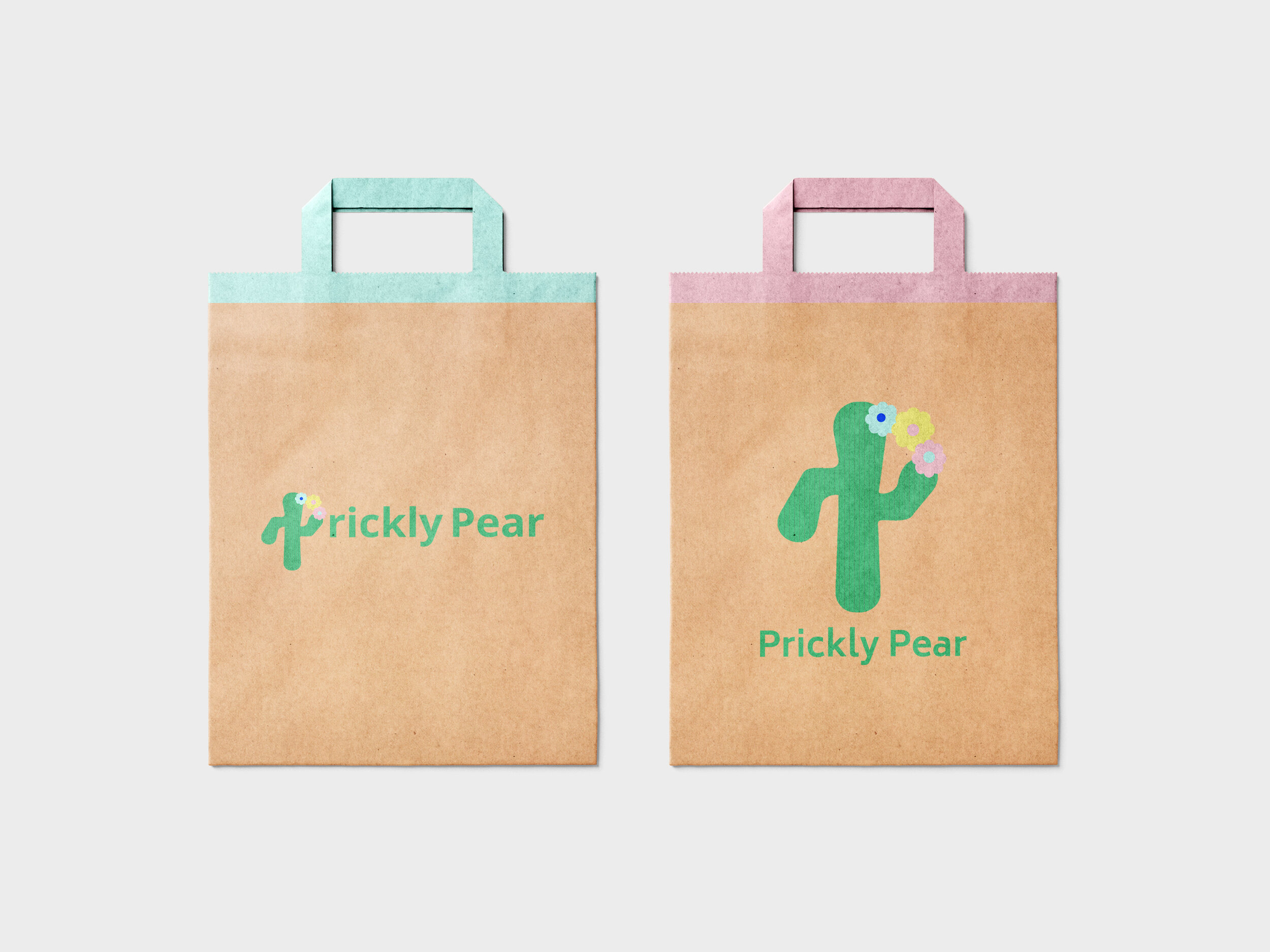
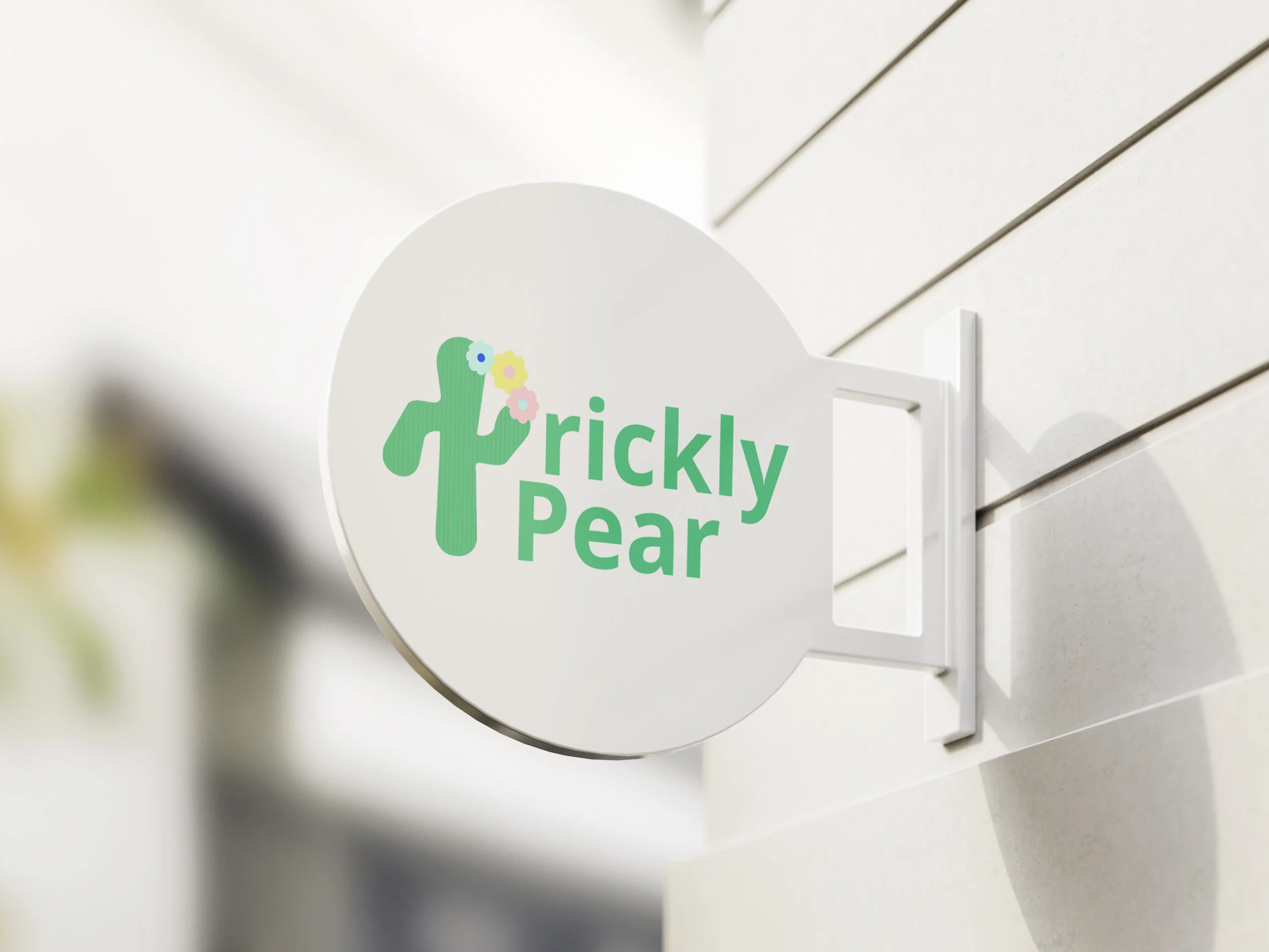
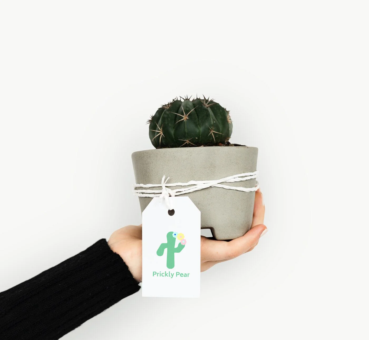
Marketing Assets


Physical Application
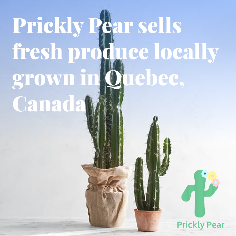
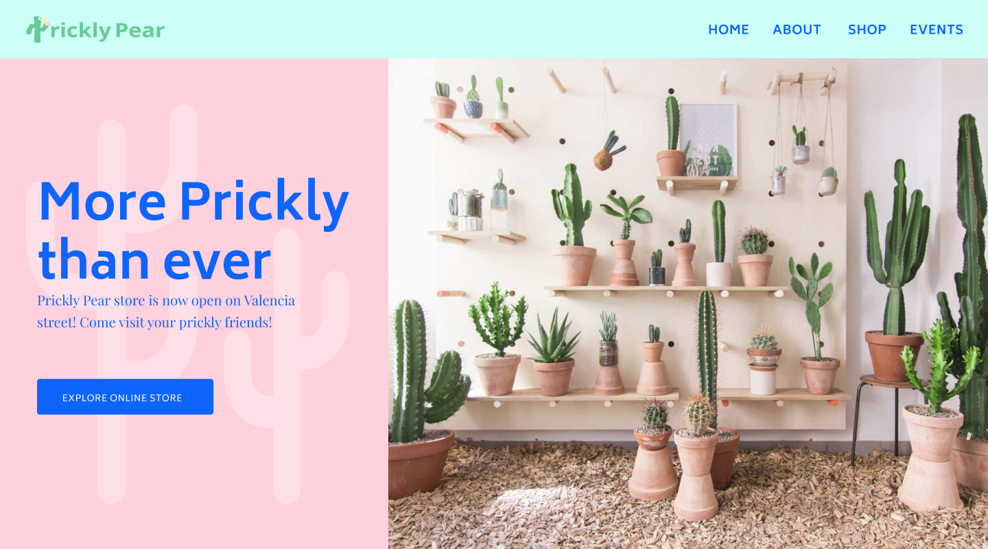
Website Application
Hero Section
Shop Section